A full-featured and fully creative app designed for family and community entertainment.
Kidzkrew is a mobile application that unifies kid's activities in Dublin and other cities. Keeping families informed of a variety of events and staying up to date on current leisure activities is a key function of it. In addition to being a centralized hub of information, the app allows businesses to target specific audiences through its dedicated social media environment.
Currently, there are no platforms or services in the entertainment industry that are dedicated specifically to family events and activities. Although there are social networks and websites which hold information about kids events, they are not mobile-friendly nor do they hold enough information as a family-friendly event hub app would, nor do they organize events for them. In addition, finding events around social networks requires a lot of time unless you already know where to find the best information and sites. To find these events, people will have to search for them and follow certain companies or organizations.
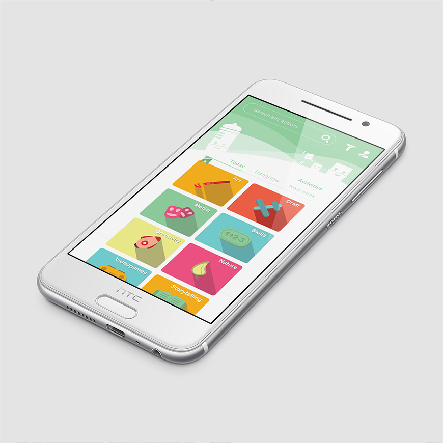
It took 8 months to create this app, which followed a brief that included a timetable to ensure the goals would be achieved.
Based on interviews and surveys conducted with families in Dublin city centre and Tallaght who were willing to attend family-friendly events, this project was developed.
We created different user scenarios by following the main idea of the app, which was to offer a service in the market that would connect communities and families within a friendly-social business environment.
As a result of defining common scenarios, I was able to define the main personas as follows:
It is clear that the study needs to be more detailed and focused and a deeper understanding of personas needs to be developed. For a better understanding of the right target, some interviews were needed. Afterwards, these results will be presented.
As a result of the app structure, I was able to determine how functionalities would be organized. I also determined how the user flow would be structured, and what wireframes should be aimed at.
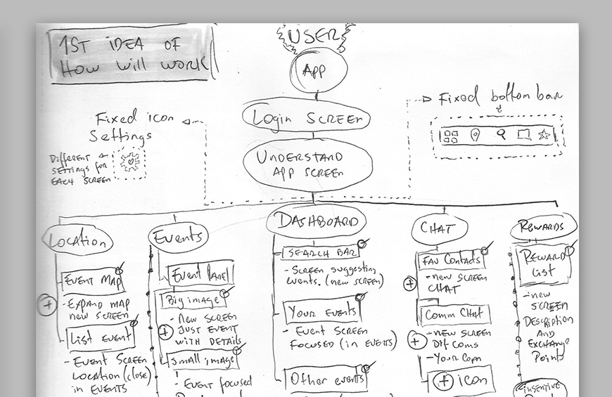
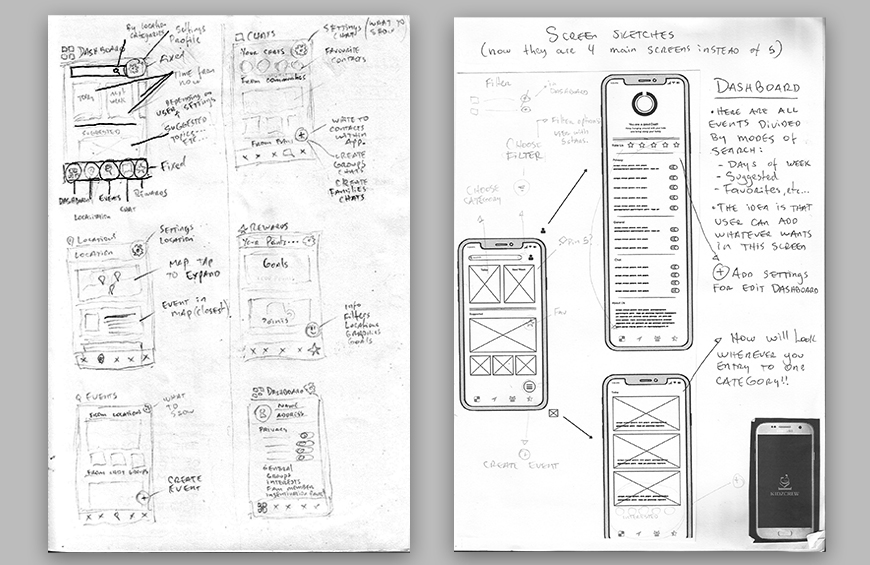
By planning appropriately, I was able to create wireframes confidently. Choosing low-fidelity wireframes with very little detail, I focused more on the functionality and structure of the app. Although I could add design elements later, the most important aspect of the project was the clarity and simplicity of the product.
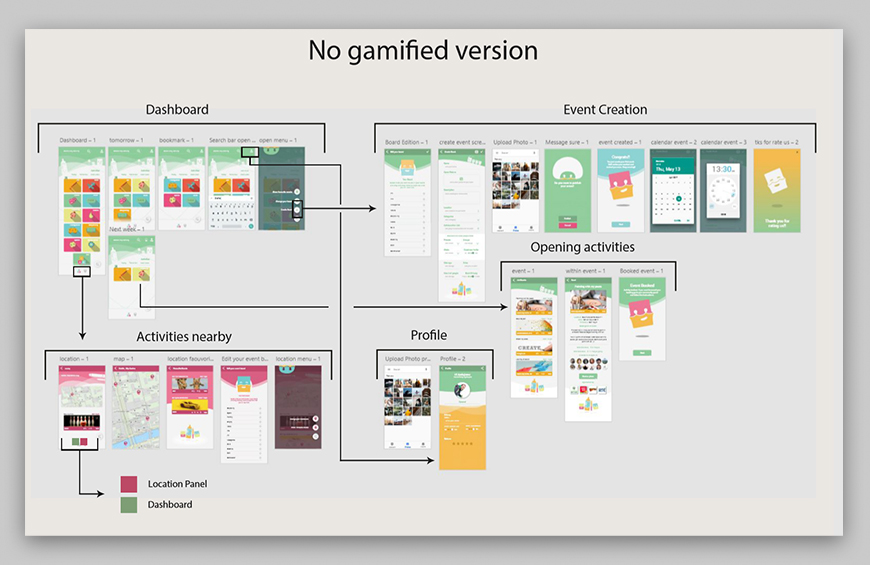
Using these diagrams, I discovered new ways in which tested users used this prototype that I hadn't considered before. It was also helpful to have a better understanding of the app and catch broken features or missing components before it was presented to customers. I created two different user flow versions; a basic version that would just show the events to attend and their locations on the map, and a gamified version with more features such as the ability to create events, organize them, a rewards panel, and community chat.
User testing is a technique used in user-centered interaction design to evaluate products by testing them on real users. Since it gives direct feedback on how real users use the system, this is an irreplaceable usability practice. Therefore, I decided to use this technique in the project with these tasks:
There's still some work to do on swapping between the basic and gamified versions.
| Before | After | |
|---|---|---|
| Navigation controls | 2 | 5 |
| Events information/bookings | 3 | 5 |
| App versions | 2 | 2 |
| Get rewards | 1 | 4 |
| Community inbox chat | 2 | 5 |
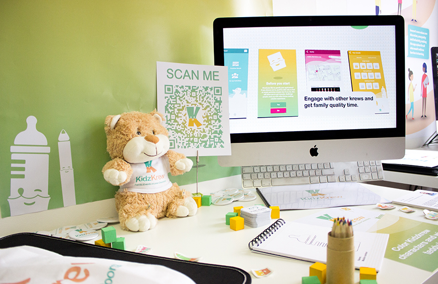
The app design was a fusion of colours, shapes, design styles, and my own ideas. The app design was based on a clear structure for presenting events to users. I created a simple and clear hierarchy by grouping them into categories and adding features within the app.
It combines different colours and characters while playing with transparency and negative space. It is essential to use a flat design to achieve a minimal amount of style elements. This will give the illusion of three dimensions making the design simpler and more spacious.
The colours yellow and green were chosen because they are gender-neutral and don't identify any gender. Other colours are used for illustrations, characters, shadows, shine, and to identify which section of the app the user is in.
The last version of the logo was always used to create different motifs, backgrounds, and useful visual reinforcements. My logo inspired me to create shapes, contours, negative spaces and angles to create useful items that help to expand the project's identity.

According to the results of my surveys and interviews, I reached 50 people. This made me realize that there might be a market for an app like this. Please feel free to check the results in the link below.
To accomplish the business & customer tasks, I created a mockup application. Through UI testing, I was able to better understand how to structure the application to provide the best user experience for Kidzkrew's users. Although I understand the errors of the previous version, which concentrated only on the visual aspects, I still know there are changes to come.
As I plan to further improve their service, I still have a lot of work to do. Stay tuned!