An enhanced UX/UI redesign for a task management platform.
The TRUwork application enables peers to connect with nearby or localized skilled professionals to resolve day-to-day challenges.
It has its own management services that categorize different task processes to know relevance, amount of workers available, quality of each individual task, among others in order to secure and demonstrate outstanding solutions by demonstrating to the customer and TRUteam the steps taken to fix the problem and its final result.
As the project progressed, the main concern was the lack of white space, a user-focused experience, a better layout and a more streamlined design style.
The previous version had a lot of clutter and the design line wasn't the best, creating an uncomfortable experience for users. Additionally, there was a lot of information and repetition of features which rendered the layout incorrect. This made the project even heavier and not portraying the correct feel and look of the project.
By following the brief, strategy, and changes being implemented by the client, we could monitor the progress of the project. In order to design it, develop it, test it, and get some feedback from real customers, it takes about a month for each stage of the change.
The extensive research market provided the basis for understanding the usability, feel, and look of different dashboards and how they would be made responsive across all devices. To make this project a success, it was crucial to conduct a study of current companies on the market, such as Jira, which was a good example.
In order to optimize the usage of their features, actions, and user flows, we organized, categorize, differentiate, and studied the relevance of each persona after gathering enough knowledge about UX/UI on dashboards-focus. This enabled us to get rid of unrelevant information and focus only on KPIs and core functionalities.
The third and final step was to compare the previous version with the research material to modify the visuals, and layouts, pushing out a new and improved design line. During this stage, simplicity reigned by minimizing uncomfortable usage and irrelevant features. Every change made to the project would rely more on the results of testing.
Upon starting the project, the PM already had a version of the user scenarios and personas which helped me upgrade it to the next version of its brief. As the platform evolved, it became evident that there was more to do on each individual screen than on the entire picture.
I gathered a team of PMs, developers and myself to find and collaborate in order to get knowledge from different industries and personalities and combine them to find the best solutions. We held these workshops not only to achieve better clarity and understanding of the layout, personas, and functionalities but also to agree on the best solutions we could consider ideal. It resulted in an enhanced user experience, look, and feel, but we also ensured that the core functionality would not be compromised.
During my research, I found that the Personas were unclear among all the parts. Different people with different permissions would have access to the site in different ways, and some would have permissions that they shouldn't. This helped me understand each of the users and led to a discussion about it that resulted in a categorized user table that made them more easily differentiated.
A whiteboard was used to record every decision.
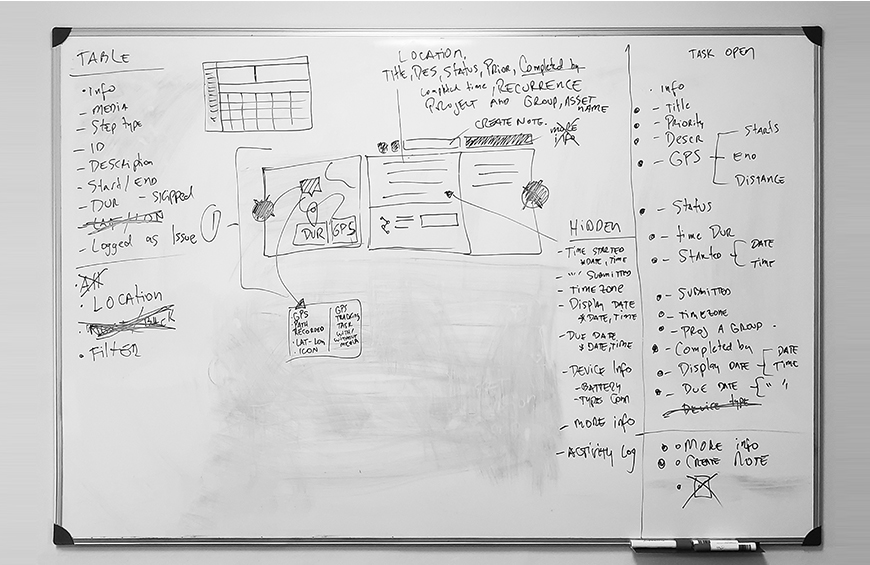
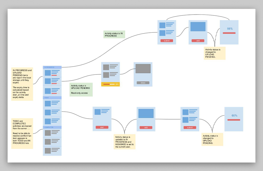
WWith a proper plan, we were able to move forward with confidence the app's wireframes. As a result, we decided to focus more on the functionality and structure of the app, opting for low-fidelity wireframes with very little detail. What was important for our users was that the product (above all) was clear and simple. We decided that we could add design elements later on in the process.
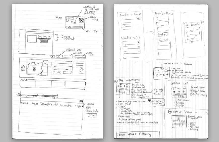
We decided to work along and have a few workshops to understand mostly the user flows from the mobile versions because they needed a bit of a tweak. The result was a wide spread of mobile screens and discussions to determine the best flow.
Real users tested every iteration and later on decisions were made. Through the testing process, more work would be created to make the product more usable. Additionally, we had a team that checked every iteration or upgrade of the platform. We also carried out different a/b tests to ensure the best results.
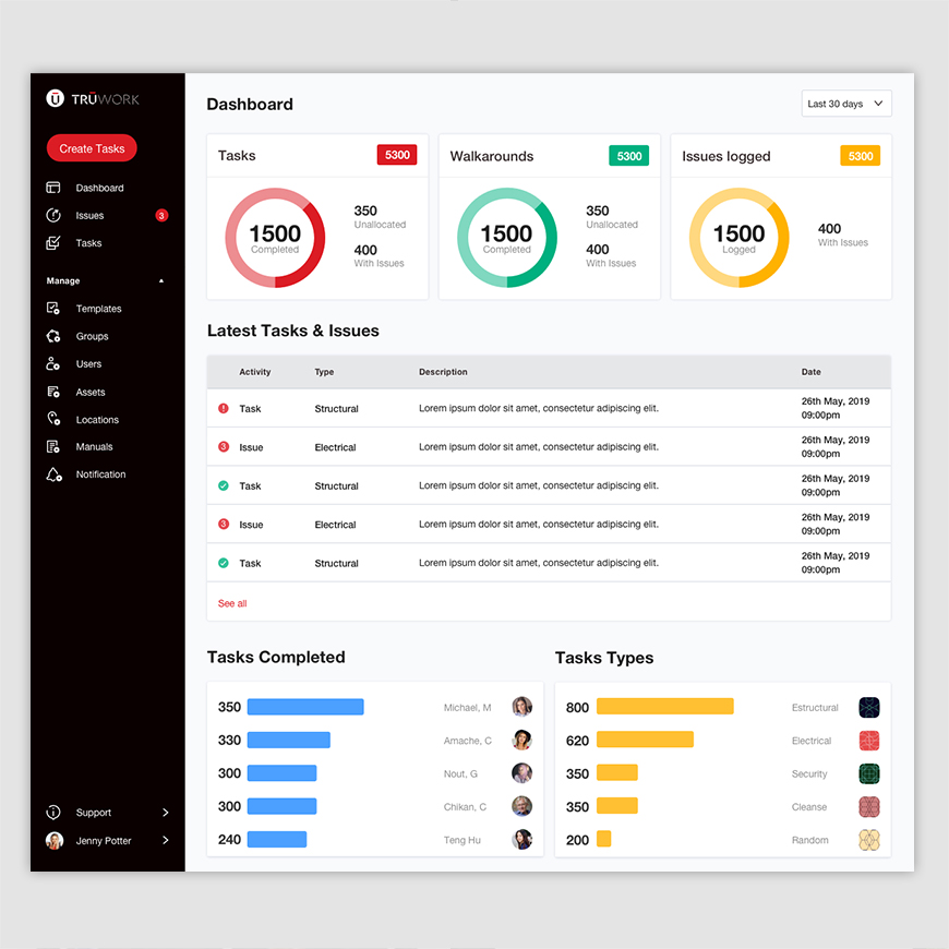
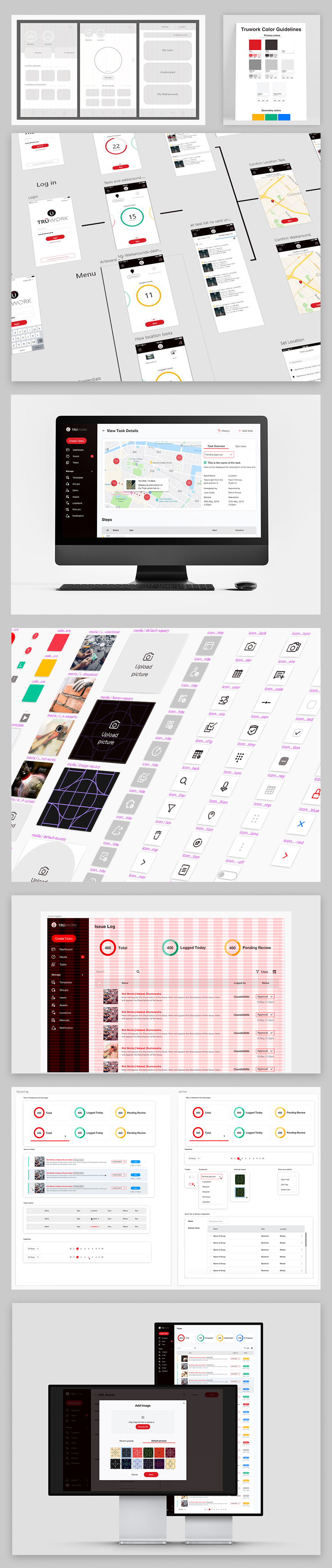
During the creation of the platform, a whole design system was created to assist in the future usage of the platform and simplify its understanding. The design system will keep all design elements and components in order and consistent.
Previously, the platform needed a refresh by making it lighter on the eye and building a stronger connection between consistency and design. Iconography and visual elements like its motifs and patterns made it more comfortable and appealing.
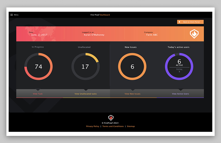
As the platform went from dark grey to light grey, it started to feel much more lively and visually appealing. Implementing the new design elements and colours blended well with the rest of the brand identity and definitely improved the design.
TRUwork achieved all of its goals by creating a fully functional platform and incorporating all improvements leaving users very happy. In order to reach more industries and customers, TRU would need to change its strategy completely, halting development and design for a while. The work made by all their resources was delivered not just as a desktop version, but as its responsive iterations on all devices as well.
The platform we created met all the expectations of the client.
The company's founders are planning to further improve their service, so they will still have a lot of work to do on their platform.